Intro
Product Overview
Research & Findings
Problem Statements
Key Decisions
Design Solutions
The Outcomes
The Learnings

Scanner Pro hadn't shipped a meaningful update in six years.

Competitors caught up on scan quality. The UI felt abandoned. The one-time purchase model had no future.

I redesigned it from scratch — structure, design system, and subscription GTM.

Product
Overview

Sole Product Designer iOS & iPadOS ~150 Screens Design System Subscription GTM 2.5 Years

Scanner Pro helps people quickly turn physical documents into clear, professional digital copies — with automatic border detection, shadow removal, and perspective correction.

After 6 years without meaningful updates, the app felt abandoned. I mapped the entire product, built a design system from scratch, and led a full structural redesign across iOS and iPadOS.

Editors' Choice by Apple · 4.9 from 299K reviews · as featured in USA Today, CNET, ZDNet, TNW, MacRumors, Macworld, The New York Times

Research &
Findings

User Archetypes
The Occasional Documenter The Organized Personal Filer
Role Individual who encounters a specific need to digitize a document: tax form, lease, ID, receipt. Opens the app a few times a year. Individual who proactively digitizes and organizes personal paperwork: receipts, medical records, contracts, financial documents. Uses the app regularly.
Goals Get a clean, legible scan in as few steps as possible. Share or save it immediately. Not think about the app until next time. Maintain an organized digital archive. Find past scans quickly. Ensure scan quality is high enough for official use.
Challenges Generic camera apps produce shadows, distortion, poor contrast. Other scanner apps require too many manual corrections. Doesn't know what to name the file. Default filenames are meaningless ("Scan 1"). No smart naming suggestions. OCR errors make documents unsearchable. Hard to find old scans.
Skills Low specialized app fluency. Will not read onboarding flows. Needs auto-detection to work on the first try. Medium-high iOS app fluency. Uses Files app, cloud sync, document sharing. Values precision over speed.
Research Method
App Store Review Analysis

Recurring complaints about shadow removal, border detection accuracy, and export flow friction.

Support Ticket Patterns

Most common failure modes in scanning physical documents.

Competitive Benchmarking

Competitive scan quality benchmarking against iOS native camera and other scanner apps.

Key Findings
FindingSourceImpact
Shadow removal and border detection were the most common scan quality complaintsApp Store reviewsDefined the core technology investment areas
Export and share required too many steps after scanning — users dropped off before sendingUsage patternsDrove single-tap share and reduced export flow
Users didn't trust auto-detection — re-scanned frequentlySupport ticketsImproved detection confidence indicators and manual correction tools
User Journey Map

Archetype: The Occasional Documenter / The Organized Personal Filer

Scenario — Digitize a document and use it
Stage
01Trigger
02Capture
03Quality Check
04Multi-page
05OCR
06Export & Share
07Archive
User Action
User needs to digitize a document — tax form, lease, ID, receipt
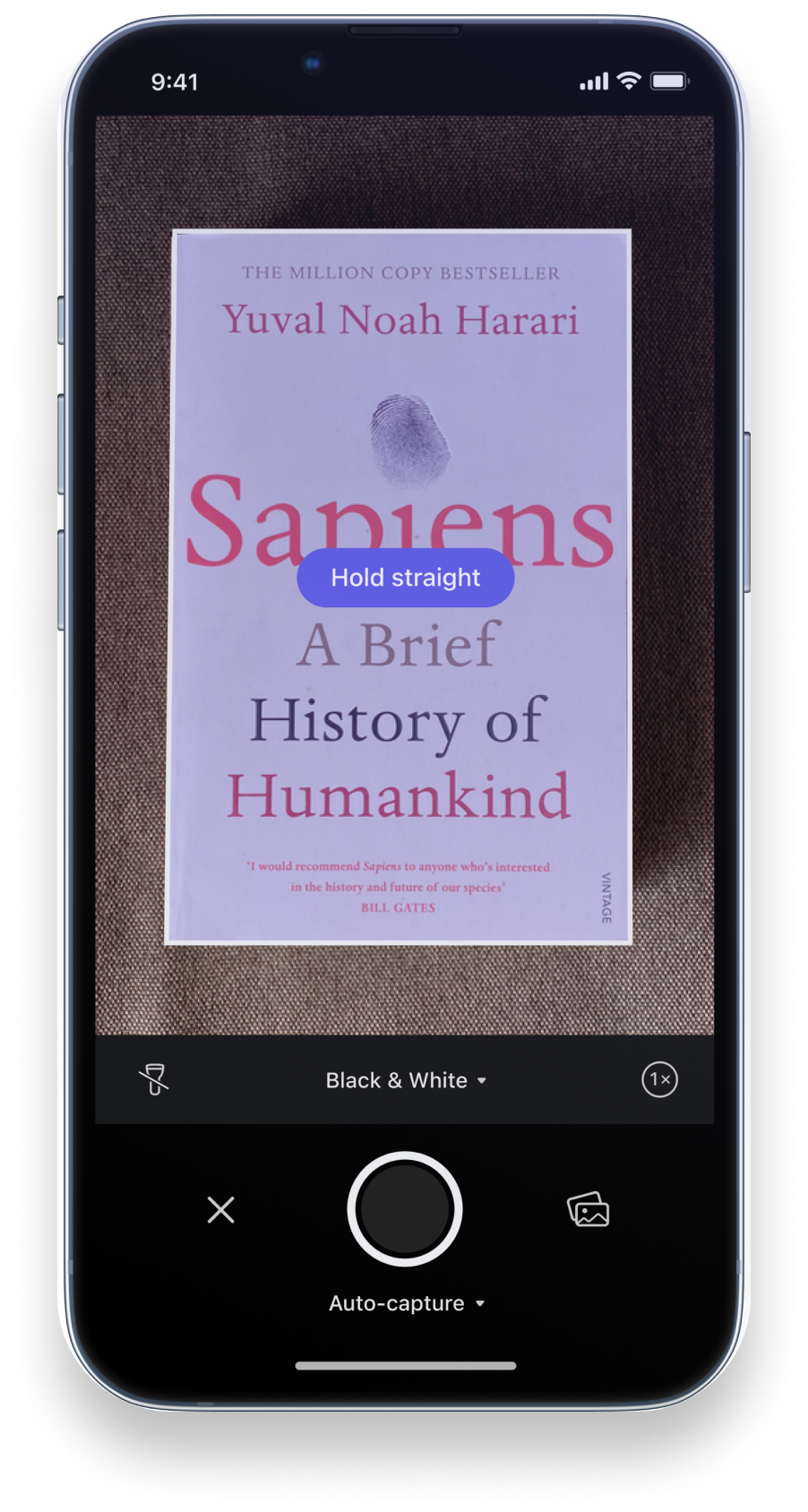
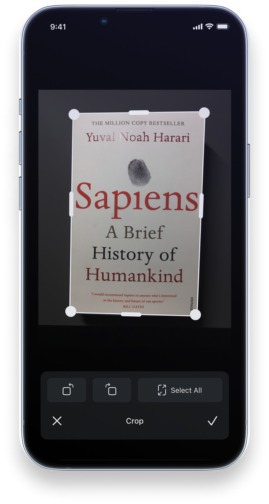
User points phone at the document and taps to scan
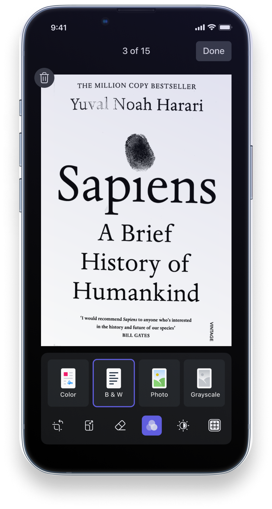
User reviews the scan result
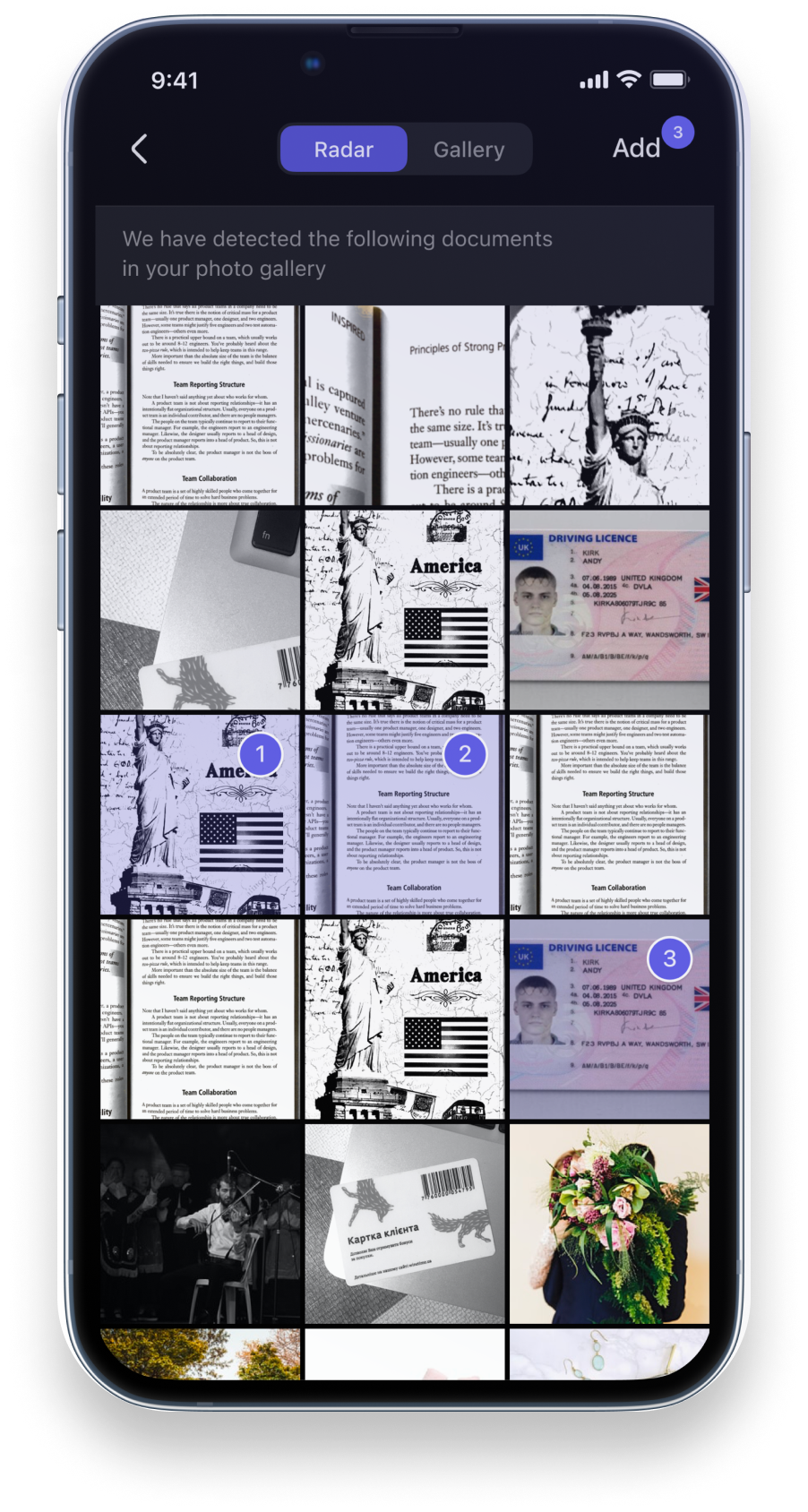
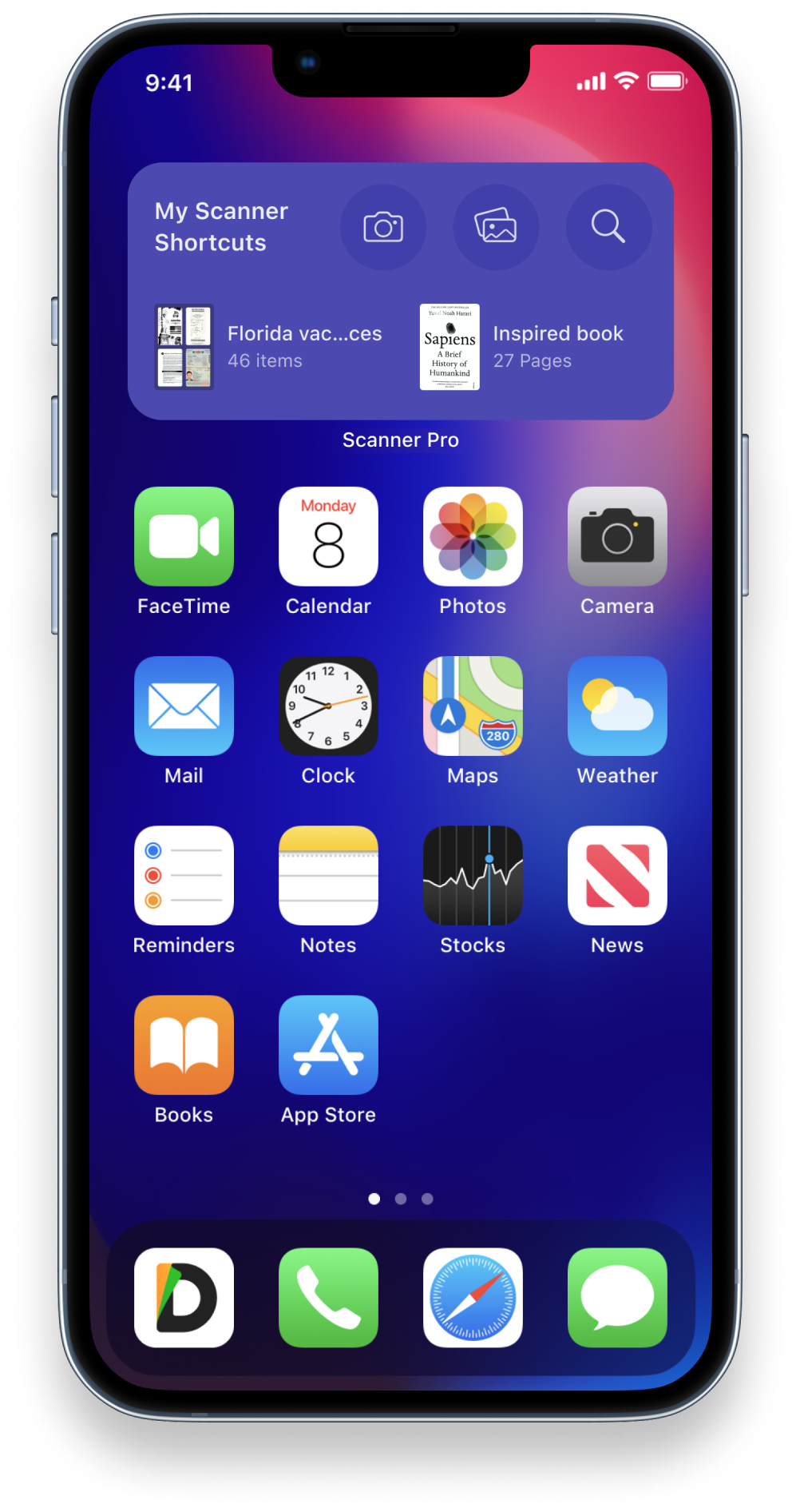
User needs to scan a multi-page document
User needs to find text within a scanned document later
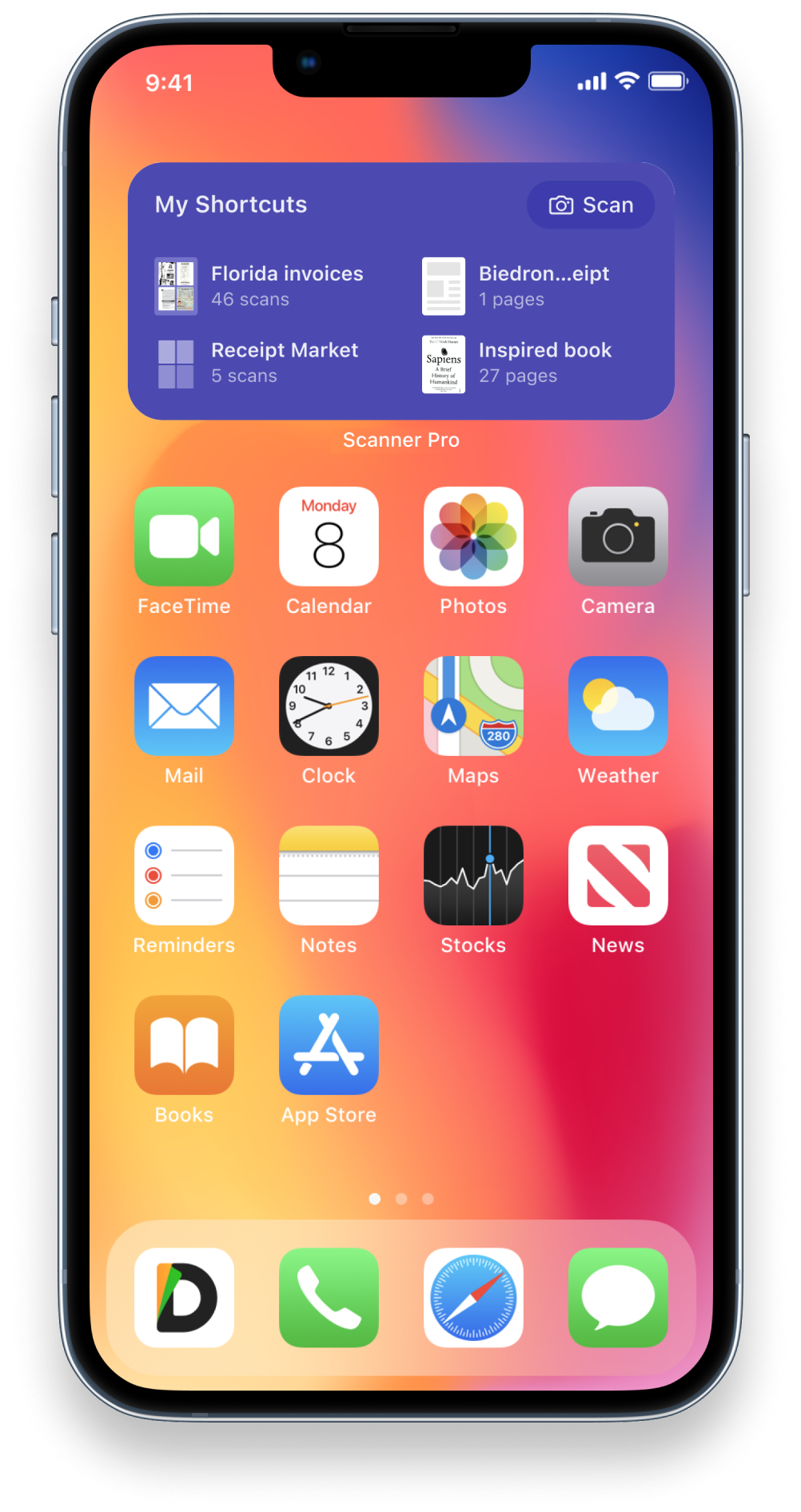
User exports to PDF and sends via email or saves to cloud
User tries to find a scan from 3 months ago
Emotion
Reluctant
Anxious
Uncertain
Cumbersome
Blocked
Efficient
Frustrated
Pain Point (Before)
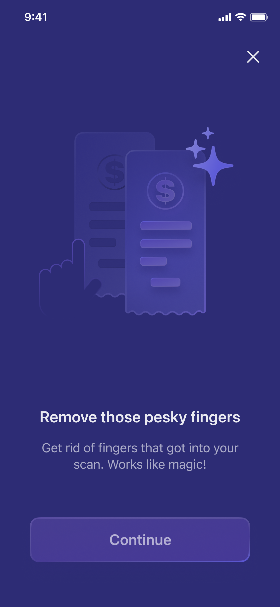
Using the native camera produced uneven, shadowed, distorted results unusable for official purposes
Other apps required manual corner adjustment every time — auto-detection was unreliable
Low-quality apps produced outputs that looked fine on mobile but were blurry when shared
No multi-page flow — each page was a separate file requiring manual assembly
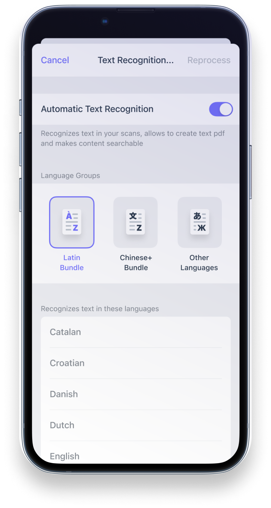
Scans were image-only — unsearchable, no text extraction
Export flows required too many steps; cloud sync was manual
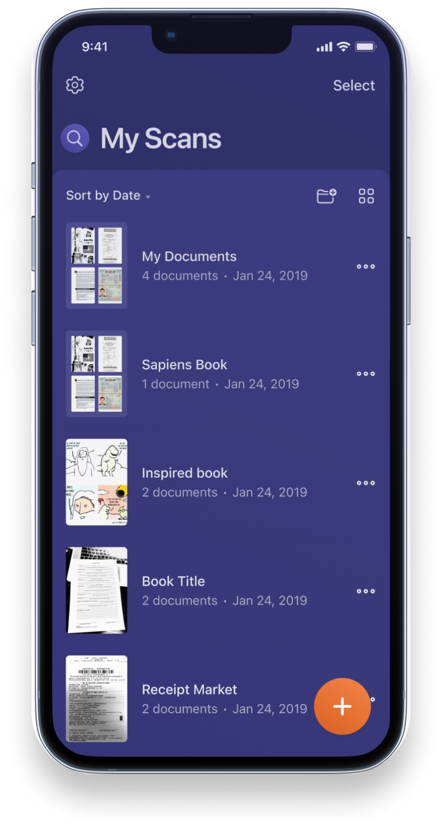
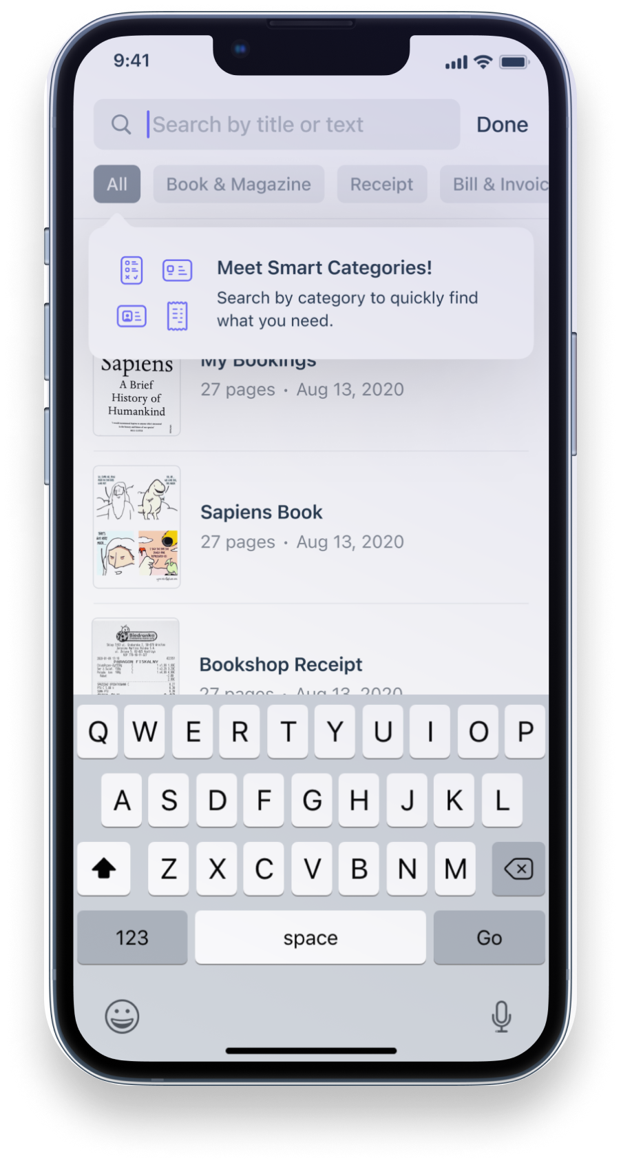
Meaningless default filenames ("Scan 1", "Scan 2"); no folder structure; no search
Design Response
Document-optimized capture: automatic border detection, shadow removal, distortion correction
Auto-detection and correction on first capture; professional output without manual intervention
High-fidelity output optimized for readability at full resolution and in print
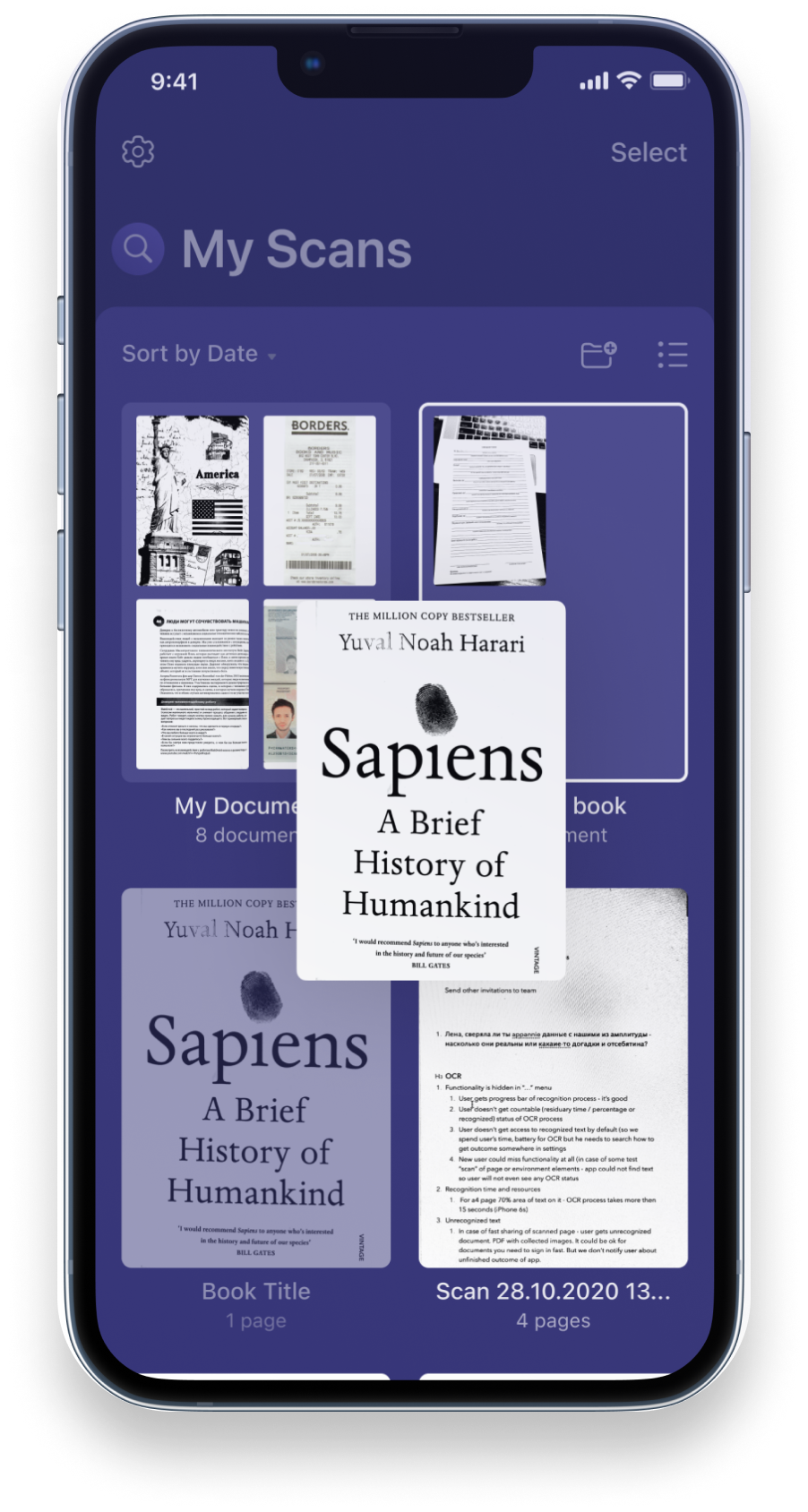
Multi-page editing: add, reorder, and remove pages within a single document before export
OCR layer makes scans searchable; text extracted for copy-paste and document search
Direct export to PDF with one-tap share to email, iCloud, Google Drive, Dropbox
Nested folder support; OCR-powered search; subscription UX redesigned for long-term retention
Emotional Journey
Cautious / Uncertain
Overwhelmed / Stressed
Neutral / In process
Relieved / Confident

Problem
Statements

WhenI want toSo that
I store my documents in the app be sure that all of them are stored reliably and securely I feel confident I won't lose them
I store my documents in the app be sure I'm protected from data loss after reinstalls or device changes I can always restore access to my documents
I need to hide certain documents in the app hide them without leaving any visible trace they exist no one would even think to look for what I'm hiding
I store documents in the app keep them in a meaningful order using sorting or favorites I can find what I need faster
App appeared outdated

No meaningful updates for 6 years while competitors moved fast. No list view, no dark mode, no modern repository patterns. Users described it as abandoned — and the App Store reviews reflected that.

﹅﹅

...I love Scanner Pro but it feels like it hasn't been touched in years...

﹅﹅

...I switched to a competitor just because it looked more modern — the scanning wasn't even better...

One-time purchase blocked growth

The one-time purchase model capped revenue at acquisition — no recurring income, no budget for ongoing investment or team growth. Subscriptions became the industry standard while Scanner Pro fell further behind.

﹅﹅

...I paid once and kept getting updates — I'd honestly pay again if there were real new features...

﹅﹅

...there's nothing to unlock in the app — a subscription tier would make sense if there were premium features...

Repository grew beyond control

Users accumulated hundreds of documents with no way to manage them effectively. No nested folders, no list view, no metadata at a glance. Finding anything meant scrolling through an endless grid.

﹅﹅

...For Scanner Pro I use it for scanning documents but I don't want to use it for organizing documents. I want my files based on open standards — I don't like relying on third-party tools to store my files...

﹅﹅

...I've got 12,000 documents in Devonthink — you can find something in a few seconds based on a whole range of criteria...

Legacy code slowed everything

Heavy technical debt slowed every feature and increased QA overhead. Many design directions weren't buildable — structure and flows had to work within real engineering constraints, not just design ideals.

﹅﹅

...I submitted feedback about nested folders two years ago — nothing's happened...

﹅﹅

...every update seems to fix one bug and introduce another...

Scope expanded mid-flight

What started as a request to update the color scheme quickly evolved into a full app overhaul — new features, a new design system, and a subscription model launch. The color change was reverted anyway due to legacy brand constraints.

﹅﹅

...I just want them to fix the basics — I don't need a new color scheme...

﹅﹅

...the app has good bones but needs a real overhaul, not just cosmetic changes...

Missing critical functionality

Users needed OCR-powered search, document recognition, and a usable multi-page editor. The existing editor required navigating in and out of each page individually — editing a 10-page scan meant repeating the cycle 10 times.

﹅﹅

...I will open files provided they can select text — not all PDFs are readable, some are just pictures of text...

﹅﹅

...to scan 100 pages I spent almost an hour because you have to confirm several times that the scanned image is fine...

Key
Decisions

Switch to subscription

The one-time purchase model had no future. Subscriptions enabled recurring revenue and justified long-term product investment. Conversion rate would decrease vs. the old model — accepted as a necessary tradeoff for a sustainable business.

Full structural redesign, not a visual refresh

What started as a color change request became a full product overhaul. Patching the existing architecture wouldn't fix the root problems — flows, navigation patterns, and information architecture all needed to be rebuilt from scratch. We also reduced the steps between scan and share, removing friction from the core workflow.

Bet on ML as the new differentiator

Scan quality became commoditized. Instead of competing on image processing alone, we bet on intelligence — automatic document type detection, smart color mode selection, and OCR as infrastructure. We prioritized scan quality (shadows, distortion correction) as the primary value proposition and added manual correction tools alongside auto-detection to build user confidence.

Design system before features

150 screens across iOS and iPadOS couldn't be designed consistently without a shared foundation. We built the design system first — tokens, components, patterns — so every feature had a single source of truth and the product felt cohesive.

Make the library work for users who already committed

Existing users had years of documents and nowhere to go. Context-aware search, automatic document type recognition, OCR indexing, and nested folders weren't just feature additions — they were infrastructure for a repository that had already outgrown the app. The people most loyal to Scanner Pro deserved a system that could finally keep up with them.

Design
Solutions

Modern repository with list view

Only a grid view existed, hiding metadata and making large repositories unscannable. Users accumulated hundreds of documents with no structure.

Decision: introduce list view alongside grid

List view exposes document name, date, page count, and context actions at a glance — making large repositories navigable without opening each document.

Decision: rebuild repository architecture with nested folders

The existing flat structure couldn't support how power users actually organized their documents. Nested folders + easy document moving replaced the workaround of redundant root-level stacks.

Repository — grid view redesign Repository — list view
Camera optimized for one-handed use

Most scanning happened on the go — receipts, business cards, forms. Controls at the top forced two-handed use in situations where only one hand was free.

Decision: move controls to the bottom

Repositioning all capture controls to the bottom thumb zone made the core action accessible one-handed. Research confirmed this matched real capture behavior in the field.

Decision: revert transparent viewfinder

Tested transparent frames that showed the document beneath guides. User testing showed an 18% quality drop — users zoomed in to "help" the detector, causing focus issues. Reverted to opaque guides with A4/Letter aspect ratios preserved.

Camera — controls at bottom Camera — aspect ratio selection
Edit & Enhancement

Editing a 10-page scan meant navigating into each page individually, applying edits, backing out, then repeating — 10 times. Users also had no visibility into whether edits were permanent or reversible, causing anxiety and support tickets about "lost originals".

Decision: swipe between pages without closing the editor

Keeping edit controls open while swiping between pages turned a repetitive 10-step cycle into a single continuous session. Batch operations became practical for the first time.

Decision: make edit states visible and reversible

Introduced clear before/after transitions and explicit apply/discard controls. Users could see what was changing and confidently commit — or undo. Support tickets about lost originals dropped significantly.

Edit — swipe between pages Edit — visible reversible states
ML-powered document intelligence

Scan quality became commoditized — competitors matched it. Scanner Pro needed a new differentiator that couldn't be easily copied and improved every scan with zero user effort.

Decision: use beta community to collect training data

Instead of buying a dataset, we engaged our 500+ beta users to tag 4,000+ documents in one week. This gave us real-world data across document types our users actually scanned, not generic stock samples.

Decision: auto-apply color mode based on document type

92% accuracy on document type detection (receipts, business cards, contracts, forms). The optimal color mode — B&W, color, grayscale, photo — is selected automatically. Every scan improves without the user having to think about it.

Feature: Magic Eraser with background restoration

An adjustable corrector with ML-powered border smoothing. Removes defects or sensitive information and reconstructs the background behind them — so the scan looks untouched rather than redacted.

Feature: automatic finger detection and removal

The most common scan artifact — fingers in the frame — is detected and removed automatically. The background is restored without any user action. Both features shipped with dedicated GTM onboarding screens at launch.

Magic Eraser — background restoration after redaction Auto finger removal and background restore
Advanced search with OCR

Most users kept documents in the root folder and relied on search — but search only matched filenames. Scanned content was invisible to it, making the feature useless for real retrieval.

Decision: elevate search across the entire UI

Search moved from buried to prominent — accessible from anywhere in the repository. Not a layout tweak: it became the primary navigation method for users with large document collections.

Decision: extend search into OCR-extracted content

Users can now search by the text inside their scans. Chose an OCR engine with strong multilingual support — Scanner Pro has users in 60+ countries and searches needed to work across alphabets and scripts.

Search — elevated prominence Search — OCR content results
Widgets

iOS and iPadOS introduced widget support. A scanning app that's always in your pocket should be available before you even unlock your phone — the home screen and Lock Screen are prime capture moments.

Decision: ship on day one of widget availability

First-mover advantage on new platform capabilities signals an active, evolving product — exactly the opposite of the "abandoned" narrative we were fighting. Designed across all three widget sizes and both light and dark appearances.

Decision: instant scan as the primary widget action

One tap from the home screen to the camera — skipping the app entirely for the most common use case. Recent documents surfaced in the large widget for quick retrieval without opening the app.

Widgets — home screen Widgets — lock screen

The
Outcomes

~7M to 9M+ users

Transitioned Scanner Pro from one-time purchase to subscription — enabling recurring revenue and long-term product investment. Conversion rate decreased vs. the old model, expected with trials, but the business became sustainable and fundable for the first time.

4.9★ · 327K+ reviews

Users saw continuous improvements and a more modern app. Reviews shifted — the "abandoned" narrative disappeared. Usability improvements measured better completion times compared with the previous version.

92% ML accuracy

Document type detection reached 92% accuracy on user-tagged training data. Built with the beta community — 4,000+ categorized documents in one week. Zero manual input required from users for the most common document types.

#1 Business · 20+ countries

Support tickets about lost originals dropped after edit states were made visible and reversible. More users adopted advanced editing features — the before/after model gave confidence to experiment. Batch editing across multi-page documents became routine.

The
Learnings

Structural redesign
over visual refresh.

Modernizing a mature product is less about new UI and more about rethinking structure, flows, and monetization simultaneously. The bar for a full redesign is high — the expectations from a long-standing user base are even higher. Clarity about what is actually changing, and why, matters as much as the design itself.

Motion as
functional clarity.

Investing in transitions and motion — not just static screens — paid off. Complex edit flows, ML detection effects, and repository changes felt clear and trustworthy because animation communicated what was happening. A strong beta community made this testable early and cheaply.