Intro
Product Overview
Research & Findings
Problem Statements
Key Decisions
Design Solutions
The Outcomes
The Learnings

PandaDoc's editor drove the most tickets, steepest learning curve, and highest first-session bounce.

Teams built dedicated roles just to operate it — workarounds that felt like 90s hardcore gaming.

I synthesized 11,000+ tickets, redesigned the interaction model, shipped without breaking a thing.

PandaDoc Editor — blocks and fields overview

Product
Overview

Responsive Web 7 Months Research Synthesis Data Triangulation Usability Testing Design System

The Document Editor is PandaDoc's core — where users create, edit, and finalize documents. Over time it became inconsistent: unclear states, repetitive actions, and fragile interactions drove support load through the roof.

I joined after a Usability Track had gathered 40+ test sessions and thousands of tickets. The team struggled to compile outcomes — I re-synthesized findings using concordance analysis, pitched a proposal to fix legacy issues, and owned the redesign across three squads for 7 months.

Research &
Findings

User Archetypes
The Document Creator The Template Creator The Account Admin
Role Regular user at a small organization — creates, edits, and sends documents daily. Often the same person who manages the account. Dedicated role in mid-to-large organizations — builds and maintains templates, configures automation, sets up fields and conditional logic for the rest of the team. RevOps, Sales Ops, or IT lead managing workspace configuration, templates, roles, and content governance. Has Admin role.
Goals Build documents quickly from templates or scratch. Fill fields, adjust content, send for signature. Minimize time in the editor per document. Create reliable, reusable templates with correct field logic. Ensure documents look consistent regardless of who fills them in. Reduce support requests from teammates breaking templates. Enforce template consistency. Control who can edit what. Maintain an organized, findable content library. Prevent users from breaking approved templates.
Challenges Editor selection behaved inconsistently. Unclear which fields were fillable vs. locked. Copy-paste broke block structure. Multi-select didn't exist. Field positioning was fragile — any layout change shifted fields. No way to lock content blocks. Complex templates required workarounds that broke on updates. Spent more time fixing than building. No reliable way to lock content blocks. Template organization mixed with documents. Couldn't deprecate outdated templates without deleting them.
Skills Medium tool fluency. Does not read documentation. Expects self-explanatory, predictable interfaces. High technical comfort. Power user of the editor. Thinks in systems — field logic, conditions, layout grids. Frustrated when the tool can't keep up with their intent. High technical comfort. Reads documentation. Thinks in systems and permissions. Frustrated by UI that exposes complexity to lower-permission users.
PandaDoc Editor — research overview
Research Method
Zendesk Ticket Analysis (11,000+ tickets)

Categorized editor-related complaints — selection errors, unexpected state changes, copy-paste failures, and field positioning bugs.

UserVoice Feature Requests

Ranked and analyzed user-submitted requests with detailed descriptions to identify the highest-demand improvements.

Amplitude & Tableau Data Analysis

Quantitative analysis of block type ratios, median fillable fields per document, and usage patterns across the ICP critical path.

Usability Health Metric (NPS + CJM)

Editor usability health score built from NPS data and customer journey mapping across key editor workflows.

Unmoderated Usability Testing (30+ sessions)

Inherited recordings from a dedicated Usability Track covering block creation, field placement, selection, and multi-select workflows.

Previous Research Synthesis

Consolidated dozens of prior research studies on individual editor components into a unified picture of systemic issues.

Data Triangulation

Cross-referenced usability findings, ticket clusters, analytics data, and session recordings to extract patterns the team couldn't compile from raw sources.

Key Findings
FindingSourceImpact
Clicking the same area produced different results depending on block type — no consistent selection modelInternal observationUnified selection logic across all block types
Multi-select was unreliable — users couldn't confidently edit multiple blocks at onceSupport ticketsRebuilt multi-select as a core interaction
State transitions (selected, editing, locked, formula) were visually indistinguishableHeuristic reviewIntroduced clear visual states per block type
Business impact

The editor problems weren't just UX friction — they had direct business consequences that reached sales, CS, and engineering.

CS was routing around the editor

Customer Success reported users avoiding direct editing altogether — using uploaded PDFs instead of native documents. The editor was the gateway to PandaDoc's core value, and customers were finding ways not to use it.

Organizations built dedicated editor roles

For existing users the learning curve was so steep that some medium and larger organizations created dedicated internal positions just to operate PandaDoc's document editor on behalf of colleagues.

Workarounds that "resembled hardcore gaming from the 90s"

Without copy/paste or multi-select, users invented elaborate workarounds. To copy a block from page 2 to page 11: duplicate page 2 → move it next to page 11 in the page manager → drag-and-drop across. Users documented these flows and shared them internally.

Engineering maintenance cost

Three squads actively modifying an aging codebase — one of the most complex in the product. Delivery time for new features was inflated by legacy constraints. Up to 70% of my time during active development was spent on support and ad-hoc adjustments mid-sprint.

Usability test — blocks and fields PoC
User Journey Map

Archetype: The Sales Rep  ·  Scenario: Edit a document and work with blocks and fillable fields

Stage
01Trigger
02Block Selection
03Multi-select
04Field Interaction
05Completion
User Action
Rep opens a template to customize it for a specific deal
Rep clicks on a content block to edit it
Rep needs to move or delete several blocks at once
Rep fills in a variable field or configures a pricing table
Rep finishes editing and sends the document
Emotion
Routine
Confused
Frustrated
Uncertain
Confident
Pain Point (Before)
Editor behavior was inconsistent — clicking the same area produced different results depending on undocumented block type rules
Single-click sometimes selected the block, sometimes entered edit mode, sometimes did nothing — no visual feedback on state
Multi-select didn't exist — rep had to act on one block at a time for bulk operations
Fields looked similar to regular content — unclear which were fillable, which were locked, which were formula-driven
Errors during editing were discovered only at send time — broken fields and accidental deletions caught too late
Design Response
Selection logic unified across all block types; behavior predictable regardless of where you click
Clear visual states for selected, active, and locked blocks; consistent click behavior across all block types
Multi-select implemented with keyboard and drag support; bulk move, duplicate, and delete
Visual differentiation between editable fields, locked content, and formula fields; states clearly communicated
Inline validation and field completion indicators show progress before send
Emotional Journey
Cautious / Uncertain
Overwhelmed / Stressed
Neutral / In process
Relieved / Confident

Problem
Statements

Top source of support tickets

The editor was the most critical part of the product and its most complained-about. Activation and retention suffered directly — the learning curve kept new users from reaching their first successful document.

﹅﹅

...I spent 20 minutes trying to figure out how to add a signature field before giving up and calling support...

﹅﹅

...the editor is the main reason I hesitate to recommend PandaDoc to others...

No multi-select, no batch actions

Users had to act on blocks and fields one by one. No group operations meant repetitive work at scale — and a higher rate of input errors when building complex documents from scratch.

﹅﹅

...I have to click every single field one by one — for a 50-field document that's insane...

﹅﹅

...selecting multiple blocks should be basic — I can't believe it's not there...

The architecture made the product impossible to improve

Fields lived on a separate rendering layer with no structural connection to the content blocks they belonged to. Any change to layout dimensions, grid, or block sizing would shift fields from their original absolute positions — corrupting fillable field placement across all existing customer documents. The system was frozen: it couldn't be fixed without breaking every live document in production.

﹅﹅

...when I resize a block all my fields shift and I have to reposition everything by hand...

﹅﹅

...I stopped using fillable fields because they never stay where I put them...

Assigned vs. unassigned was invisible

Color was the only signal distinguishing assigned from unassigned fields. It failed A11y, it failed in low-contrast environments, and it failed users who simply didn't know the convention.

﹅﹅

...I couldn't tell which fields were mine and which belonged to the other signer...

﹅﹅

...the colors all look the same on my screen — I have no idea what's assigned to who...

States were unpredictable

Blocks and fields had no consistent hover → select → focus hierarchy. Users couldn't predict what a click would do, leading to accidental actions, lost selections, and frustration with the basics.

﹅﹅

...I click somewhere and never know if I'm editing or just selecting — it's confusing...

﹅﹅

...I accidentally deselected an entire section once and had no idea how to get back...

Copy/paste was unreliable

Copying blocks and fields across templates and documents produced inconsistent results. Users couldn't trust the operation, so they rebuilt from scratch — multiplying time spent and input error rates.

﹅﹅

...copy-paste between documents never works the way I expect — I just rebuild from scratch...

﹅﹅

...I tried pasting a block from another template and half the fields just disappeared...

Key
Decisions

Research synthesis workshops — block and field problem mapping
Unified interaction model before any features

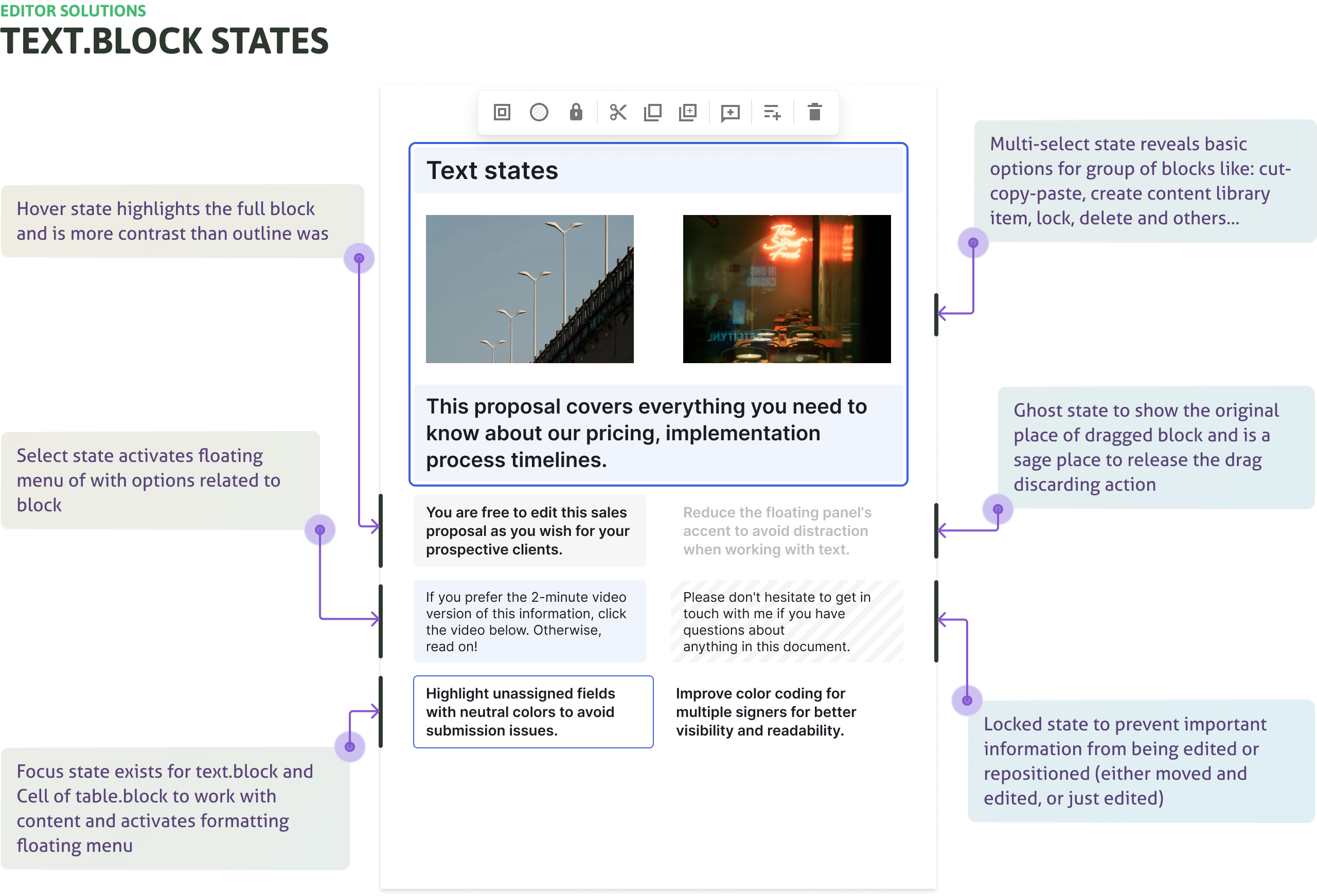
Clicking the same area produced different results depending on block type. Before shipping anything visible, we defined a single base → hover → select → focus hierarchy that every element follows — blocks, fields, text. Without this foundation, every subsequent fix would inherit the same unpredictability that created the problem in the first place.

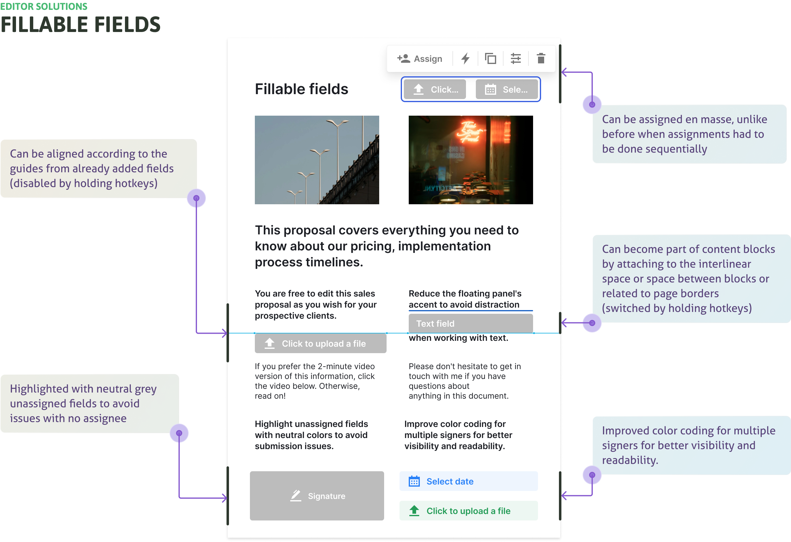
Replace color-only field states with accessible surface layering

Assigned vs. unassigned was distinguished only by green and terracotta — invisible to colorblind users, meaningless to anyone who didn't know the convention. We replaced it with shape, label, and surface elevation. Designed 8 accessible colors for multi-assignee workflows. Unassigned fields got solid transparent grey backgrounds so they stay readable even when overlapping content.

Multi-select, multi-assign, and batch operations as core interactions

Every test participant attempted multi-select — it was a basic expectation, not a power feature. We built it with keyboard and drag support. Fields can now be assigned to multiple recipients in a single action. Batch operations — select, move, assign, copy, delete — replaced the 3–4 click-per-field workflow that had no group path at all.

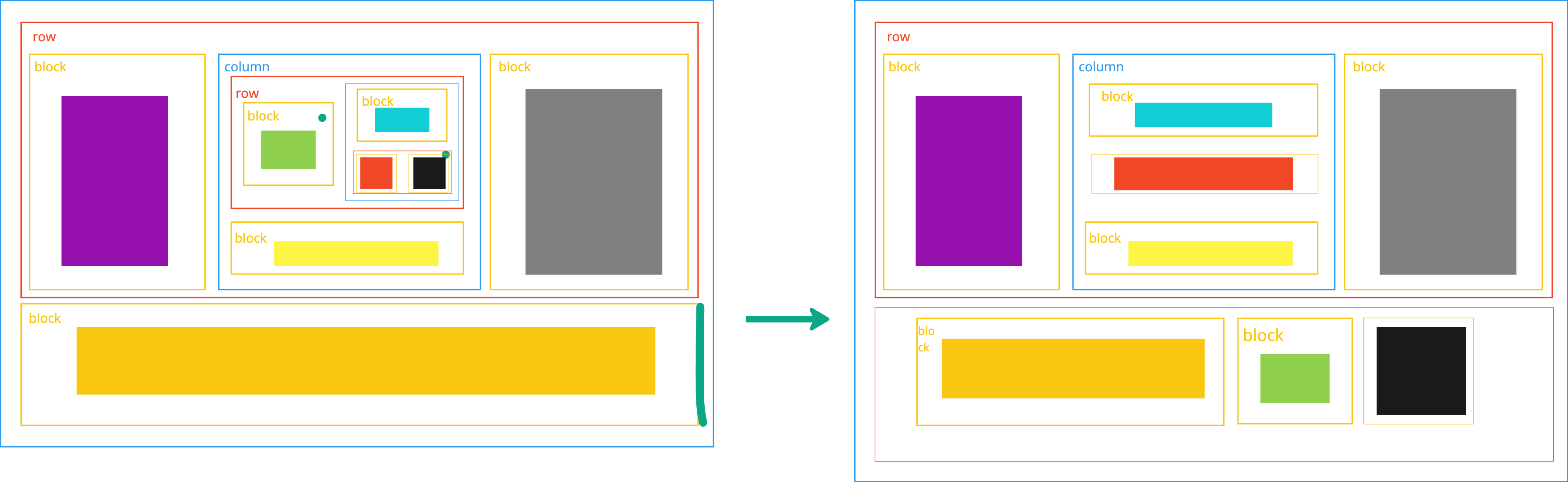
Preserve block structure on copy/paste

Pasting blocks silently destroyed grid layouts — forcing users to keep documents simple or rebuild from scratch. We made PandaDoc preserve the full row/column/block hierarchy when extracting or inserting any block. About 8 states cover the full range of transfer principles between rows and columns.

Controlled rollouts at ~10% scope per release

The field layer couldn't be structurally changed — every release had to be surgically scoped. Roughly 10% of the intended change at a time. Each release validated before the next was cut. Not iterations in the product-launch sense: controlled rollouts designed to catch regressions before they reached the full user base.

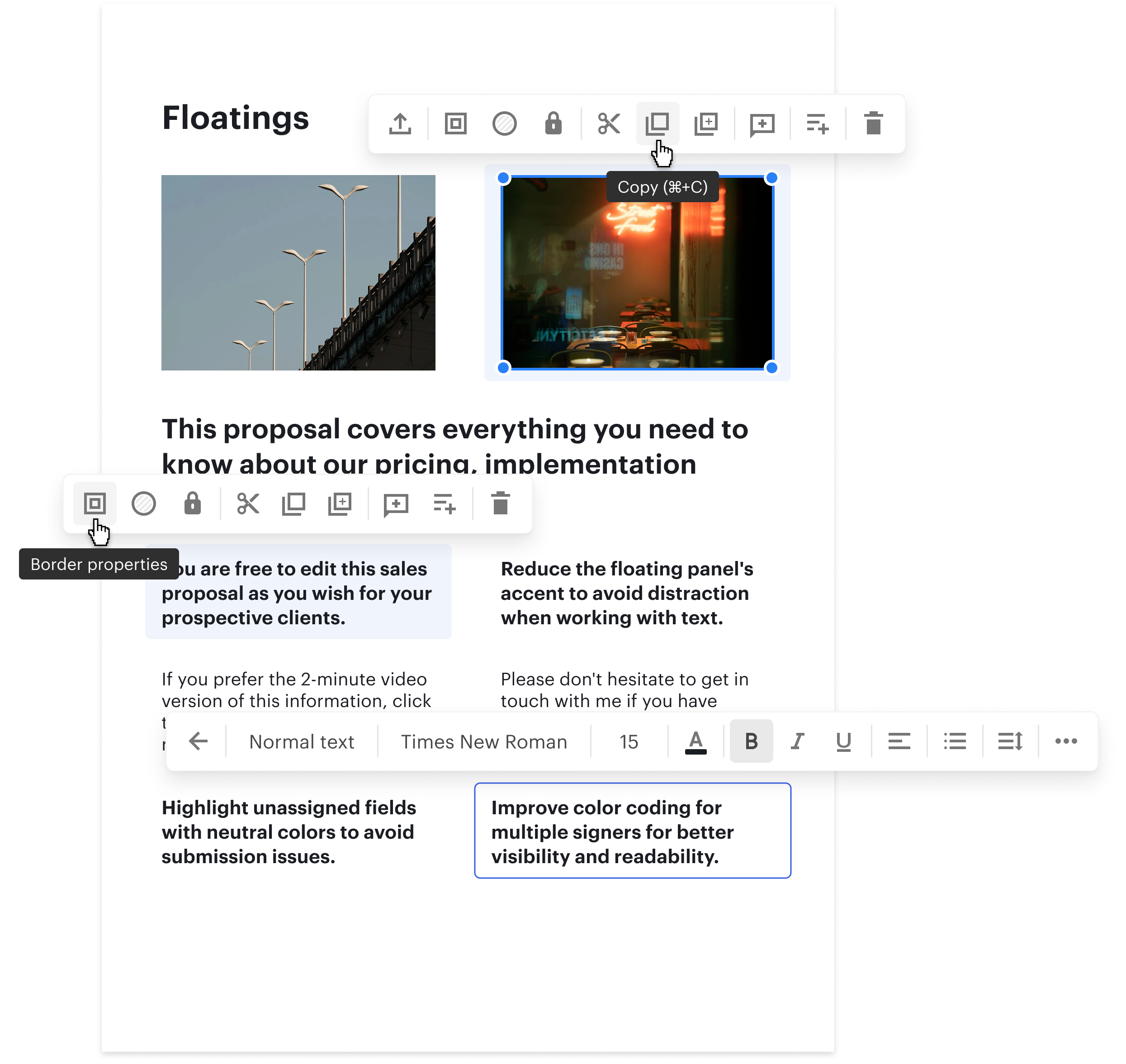
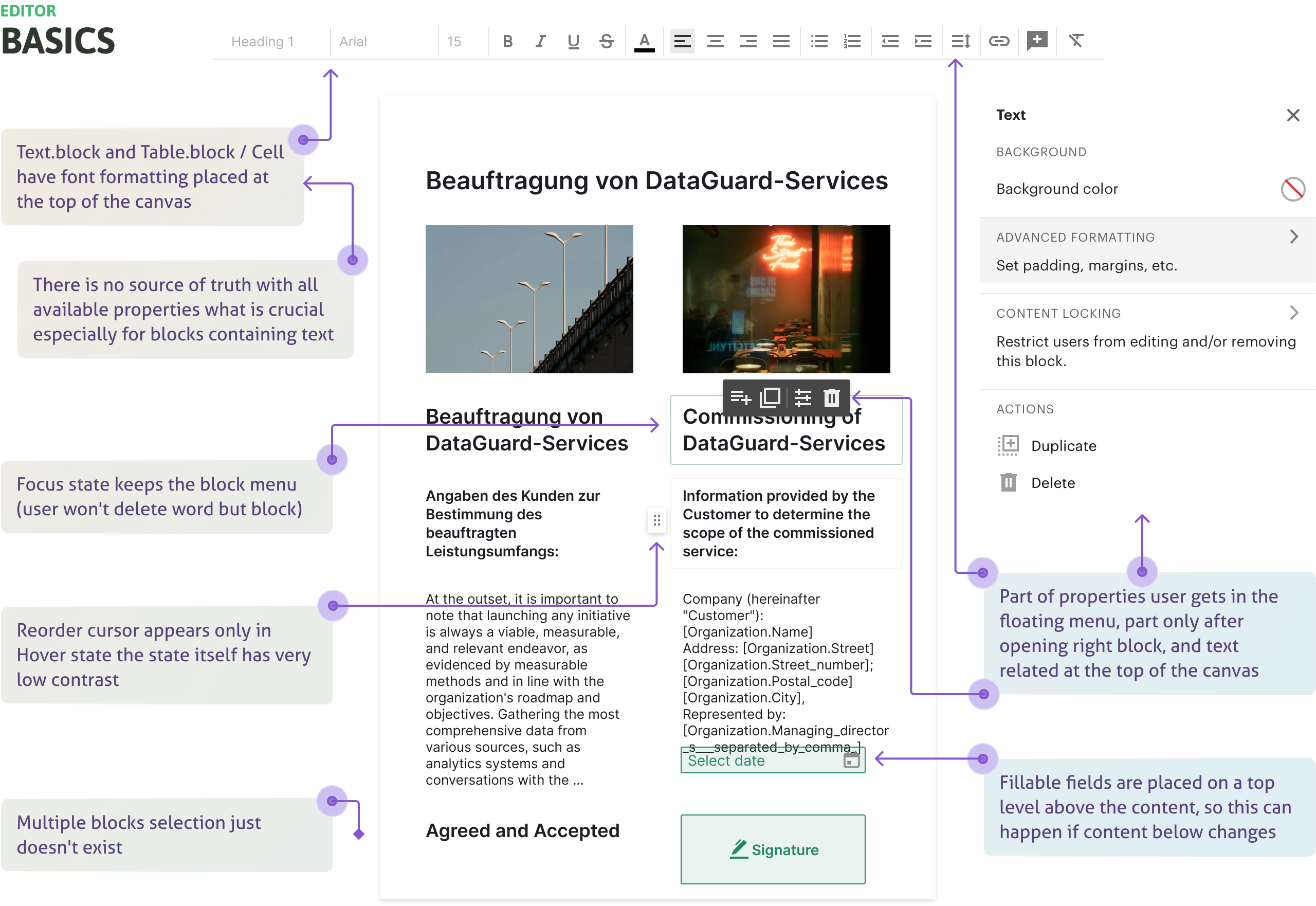
Right panel as single source of truth

Block and field properties were scattered across floating menus, a top toolbar, and hidden adjust icons. We consolidated everything — formatting, layout, field logic, assignment — into a unified right panel. Advanced options, conditional logic, and less-used settings all accessible in one place without hunting.

Design
Solutions

Original state of the PandaDoc Editor — before redesign
v.0 — Research validation

Before redesigning anything, we needed to confirm the hypotheses. We knew block-based editors confuse users coming from Word. We suspected states were unclear. We had guesses about what multi-select should do.

Confirmed: Word users struggle with block-based editing

Users with strong Word backgrounds consistently tried to select text across block boundaries — triggering block operations they didn't intend. The interaction model needed to make block vs. text editing visually unambiguous.

Confirmed: states of blocks and fields were unclear

Users couldn't reliably identify whether an element was selected, focused, or in its default state. They described the editor as "not responding" when it was — they just couldn't read the feedback.

Confirmed: multi-select and copy/paste were expected, not optional

Users attempted multi-select in every session — it was a basic expectation, not a power feature. Its absence was a blocker, not an inconvenience.

v.1 — Core interaction model

The first shipped iteration established the new interaction hierarchy and tackled the field layer problem — the two issues with the widest blast radius across the product.

Decision: base → hover → select → focus hierarchy

Every element — blocks, fields, text blocks — now followed the same four-state model. Cursor type, border, and background shifted predictably at each stage. Users reported feeling "in control" for the first time in usability tests.

Decision: A11y-compliant color coding + surface layering

Replaced color-only field states with a combination of shape, label, and surface elevation. Designed a set of 8 accessible colors for multi-assignee workflows — replacing the original green/terracotta pair that was effectively invisible to colorblind users. All unassigned fields got solid transparent grey backgrounds so they remain readable even when overlapping content. Surface layering changes prevented fields from shifting when underlying text was edited.

Decision: introduce multi-assign and batch field actions

Fields could now be assigned to multiple recipients in a single action. In usability testing every single participant asked for it and wanted to beta-test it before release. Batch operations — select, move, assign, copy, delete — replaced the previous 3–4 click-per-field workflow that had no group path at all.

v.2 — Block clarity and contextual menus

With the interaction model stable, we turned to the higher-level operations — how users worked with blocks as objects: moving, grouping, aligning, and accessing contextual actions.

Decision: restructured floating (contextual) menus

The floating menu was redesigned in white — reducing visual prominence while emphasizing the selected block or field. Items were split into logical groups with enhanced hover and press states. Most-used actions (move, duplicate, delete) promoted. In Select state: all block-level options visible. In Focus state: menu shifts to text formatting for Text.block, with Enter/Escape navigation between levels.

Decision: right panel as single source of truth

All block and field properties — formatting, layout, field logic, assignment — consolidated into a unified right panel. Previously scattered across floating menus, a top toolbar, and hidden adjust icons. The right panel became the canonical reference: advanced options, conditional logic, and less-used settings all accessible in one place without hunting.

Decision: improved grouping, alignment, and copy/paste fidelity

Snap guides became more responsive. Block structure is now preserved when copying and pasting within an established grid — a detail born from our own frustration as Notion users: tools that silently destroy grid layouts on paste force you to keep documents artificially simple. PandaDoc now keeps the full row/column/block hierarchy intact when extracting or inserting any block. About 8 states cover the full range of transfer principles between rows and columns.

Design solutions — v.1 and v.2 block and field states
Design solutions — contextual menus and field system
Block structure preservation — keeping hierarchy when extracting or inserting blocks
v.3 — Text blocks and design system

Text blocks account for up to 90% of document content. Getting their interaction right — especially the transition between editing the block as an object and editing the text inside it — was the final major piece of the model.

Decision: dynamic selection zones for text blocks

Increased the selectable area for the entire block while preserving the ability to jump into text editing. A refined cursor model — arrow for block selection, I-beam for text — made the mode switch predictable without adding UI chrome.

Decision: smooth transitions between editing states

The jump between block-selected and text-editing mode was previously instantaneous and jarring. Smoothed transitions made the experience feel more responsive and reduced disorientation — users stopped accidentally exiting text edit mode mid-sentence.

Decision: update ~20% of the design system

All new patterns were back-ported into the design system: token updates, component states, interaction specs. Every element affected by the editor redesign now had a single source of truth — ensuring consistency beyond the editor itself.

The
Outcomes

−22% time to complete

Existing users completed the same document tasks 22% faster — not from feature additions, but from removing the friction that had built up in every click and state transition.

+8% activation

Activation improved 8% — more new users reached their first completed document. The editor stopped being a barrier and started being the thing that made PandaDoc worth keeping.

+16 NPS (Editor)

A +16 point NPS shift from the product's most complained-about area. Users who used the editor daily noticed the change — and said so in reviews and in-product feedback.

~20% design system updated

New interaction patterns for blocks and fields became the canonical reference for future editor work — no more divergence between editor and the rest of the product.

The
Learnings

Some problems are too
big to carry alone.

I wouldn't want to handle this alone a second time — especially while supporting three engineering squads simultaneously. Complexity at that scale builds resilience, but collaboration makes it survivable. Engineers who understand the problem space stop being blockers and become your best outside-the-box thinkers. The constraint of "don't break live documents" forced precision that good taste alone never would have.

Own the hardest thing
in the product.

Building and shipping the most complex, comprehensive part of a product teaches you more than five easy launches combined. Small, repeated frictions compound into large user problems — fixing micro-interactions across many entry points delivers more impact than isolated UI changes. And re-synthesizing existing research, rather than starting over, was the right call. The data was already there. The work was connecting it.