Intro
Product Overview
Research & Findings
Problem Statements
Design Solutions
The Outcomes
The Learnings

Controls were everywhere. Users could find nothing.

Actions scattered across header, floating menu, and right panel — no logic for which belonged where.

I defined a quick-vs-deep model and redesigned both surfaces — contextual menu now adapts per element type.

B2B SaaS Editor UX Interaction Design Design Systems 2 Months
PandaDoc Contextual Menu — overview

Product
Overview

2 Months -2 Steps to key settings +43% newcomer feature adoption 2022–2023

PandaDoc's editor housed three parallel control surfaces: a header toolbar, a floating contextual menu, and a right properties panel. Each had evolved independently with overlapping responsibilities and no shared logic.

The result was a system where similar actions appeared in different locations depending on element type — and some options were technically available but practically invisible. Users navigated by trial and error, not by intent.

Research &
Findings

User Archetypes
The Sales Rep (Member) The Sales Manager The Account Admin
Role AE or BDR creating and sending proposals, quotes, and contracts daily. Spends significant time formatting and configuring content blocks. Team lead reviewing and occasionally editing documents. Needs to get in and out of the editor quickly to make approvals or corrections. RevOps or IT lead managing template structure and block configuration. Needs precise control over block settings and locking.
Goals Format documents fast without hunting for controls. Configure block settings without interrupting the editing flow. Find the right setting or action without deep product knowledge. Not have to explore the interface to complete a simple formatting task. Configure blocks precisely. Lock content that shouldn't be edited by reps. Ensure the right panel surfaces the right settings per block type.
Challenges Couldn't predict whether an action would be in the floating menu or the right panel. Controls appeared inconsistently — sometimes showed, sometimes didn't. Reps avoided formatting because it was too unpredictable. Right panel had to be manually opened for every block — didn't respond to context. Deep menu nesting made settings hard to find. Mixed simple layout settings with advanced logic in the same panel — purpose unclear, grouping unpredictable. No reliable way to lock content blocks from rep editing.
Skills High tool fluency, low tolerance for inconsistency. Develops muscle memory quickly — benefits from predictable interaction patterns. Medium platform familiarity. Primarily uses dashboard. Occasional editor user — needs interface to be self-explanatory on first encounter. High technical comfort. Reads documentation. Thinks in systems. Frustrated by UI that doesn't match the mental model of content hierarchy.
Research Method
Zendesk Ticket Analysis (11,000+ tickets)

Contextual menu and right panel complaints extracted from the same 11k editor ticket corpus — users couldn't find actions, menus appeared in wrong locations, panel behavior felt random.

UserVoice Feature Requests

Ranked requests around action discoverability, keyboard shortcuts, and contextual menu customization.

Amplitude & Tableau Data Analysis

Action frequency analysis across floating menu, right panel, and toolbar — identified which actions users actually used vs. which cluttered the UI.

Unmoderated Usability Testing (30+ sessions)

Same test corpus as Blocks & Fields — focused on where users looked first for formatting, layout, and field actions. Tracked click paths and abandonment points.

Heuristic Evaluation

Audited floating menu vs. right panel against consistency and proximity heuristics — mapped which actions belonged where based on frequency, context, and cognitive load.

Data Triangulation

Cross-referenced ticket patterns, usage analytics, and session recordings to define a clear split: quick actions in contextual menu, detailed settings in right panel.

Key Findings
FindingSourceImpact
Users couldn't predict whether an action would be in the floating menu or the right panelUsability testing + ticketsEstablished clear division: quick actions in contextual menu, detailed settings in right panel
Right panel opened automatically in some contexts but not others — felt randomSession recordingsAdded auto-opening logic tied to selection context
Contextual menu options were not filtered by what was relevant — showed everything alwaysAmplitude data + heuristic reviewMade contextual menu context-sensitive — actions filtered by element type
User Journey Map

Archetype: The Sales Rep  ·  Scenario: Use inline controls to format and configure content

Stage
01Trigger
02Quick Action
03Right Panel
04Nested Options
05Editing Confidence
User Action
Rep selects text or a block and looks for formatting or action options
Rep looks for a quick action (duplicate, delete, move)
Rep opens the right panel to adjust block settings
Rep tries to find a setting buried in the menu
Rep completes formatting without second-guessing
Emotion
Disoriented
Scanning
Interrupted
Frustrated
Relieved
Pain Point (Before)
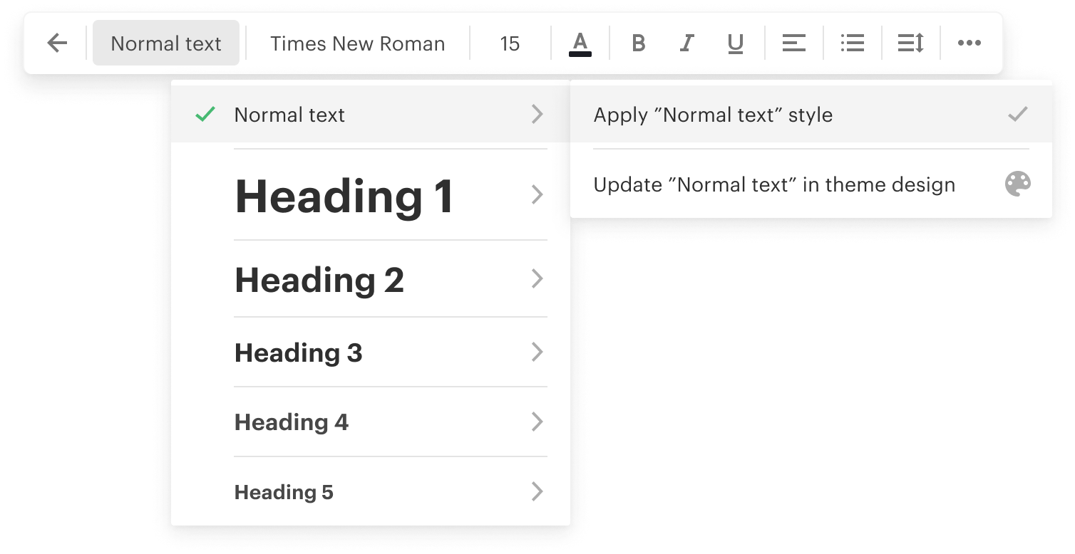
Contextual menu appeared inconsistently — sometimes showed, sometimes didn't; position varied with no logic
Quick actions and detailed settings were mixed in the same menu with no hierarchy
Right panel had to be manually opened for every block — didn't respond to context
Deep nesting made options hard to find — rep gave up and left defaults
Unpredictable controls meant reps avoided formatting altogether — documents looked inconsistent
Design Response
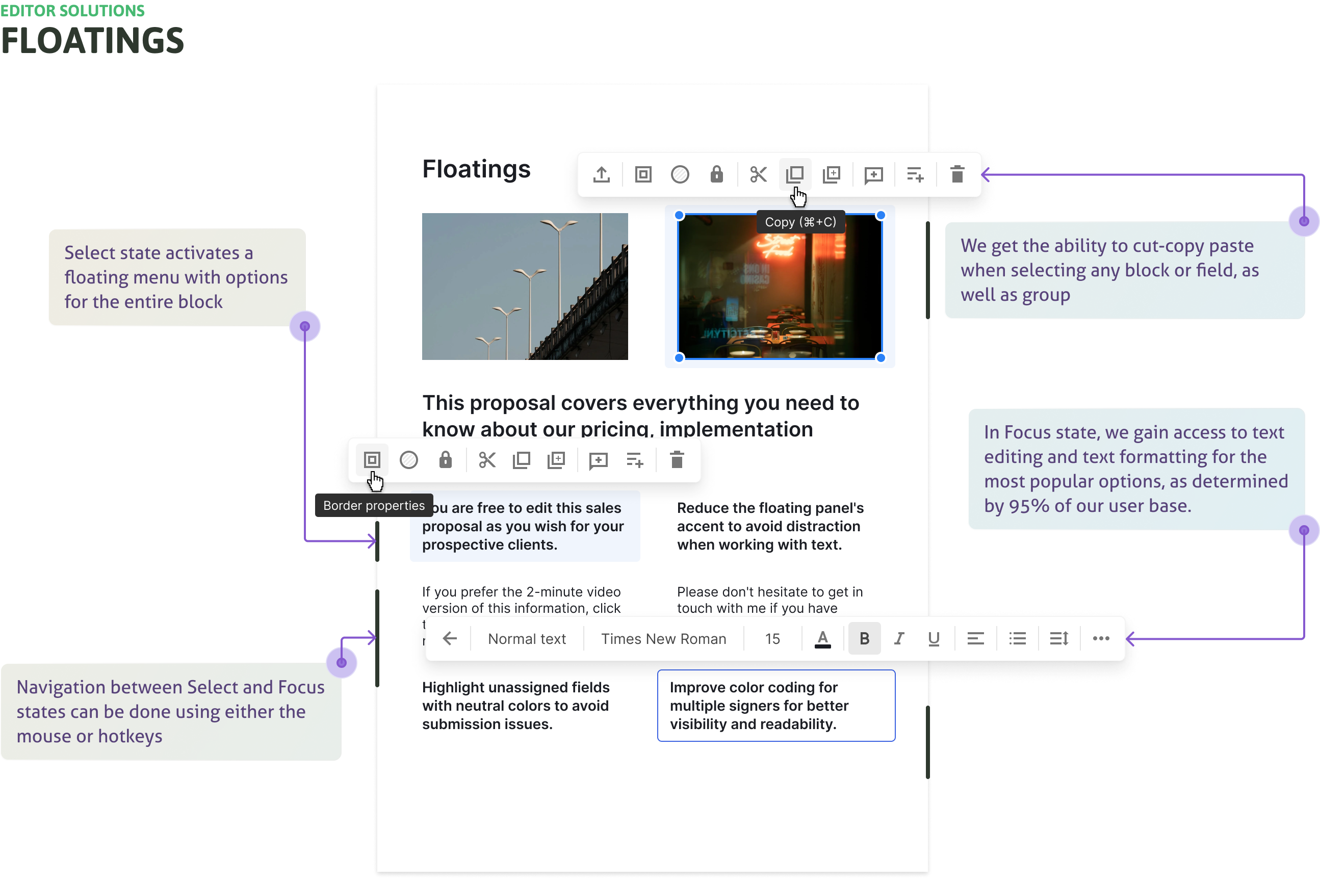
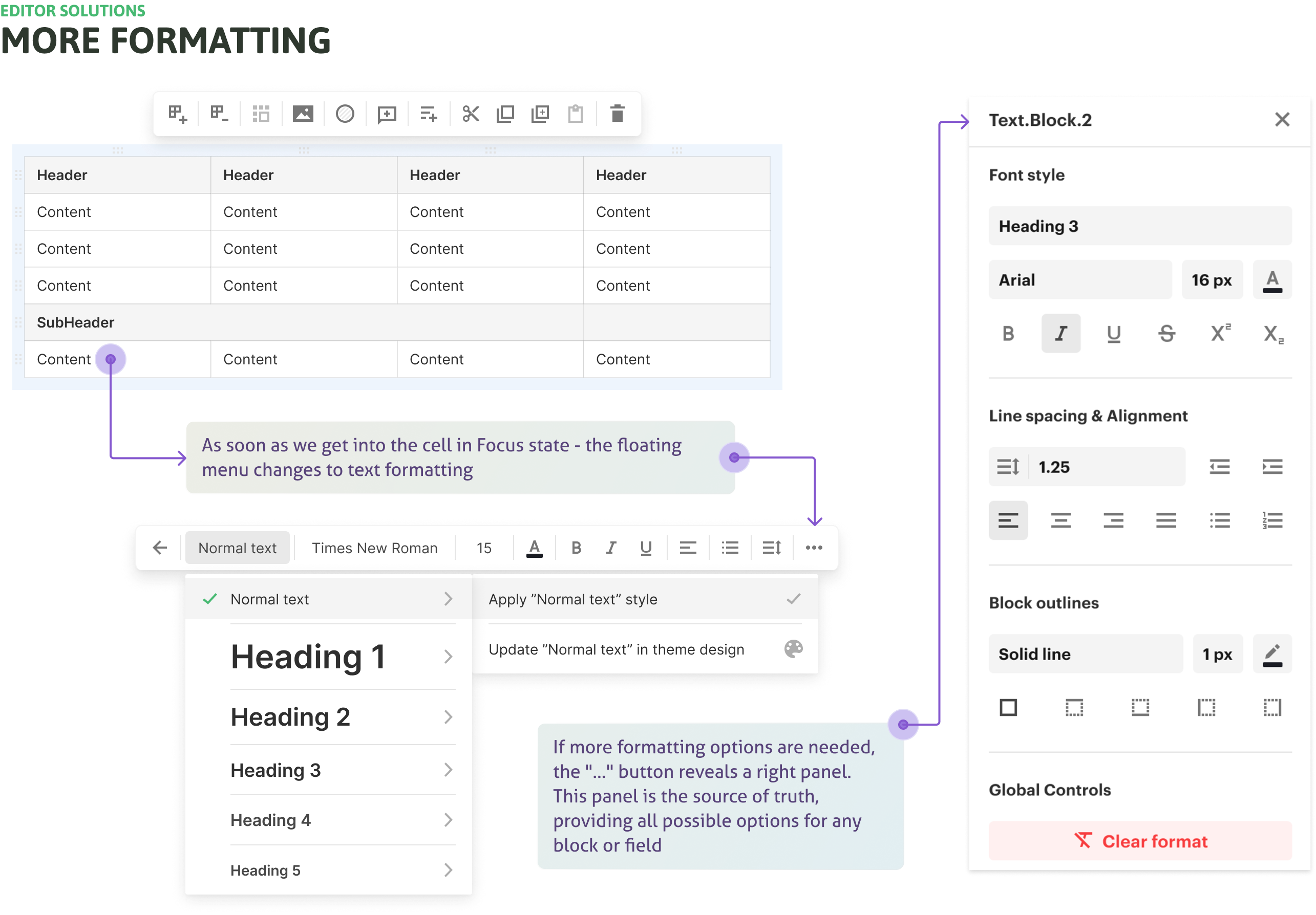
Contextual menu redesigned with consistent trigger rules and predictable position relative to selection
Floating contextual menu handles quick actions; right panel handles detailed settings — clear split
Right panel auto-opens based on selection context; shows relevant settings without manual navigation
Flattened hierarchy in contextual menu; most-used options surfaced at top level
Predictable controls reduce hesitation; reps format more, producing more consistent output
Emotional Journey
Cautious / Uncertain
Overwhelmed / Stressed
Neutral / In process
Relieved / Confident

Problem
Statements

Editor before redesign — scattered controls across surfaces
Scattered controls

Similar actions appeared in different places depending on element type. Header, floating menu, and right panel all had overlapping responsibilities.

﹅﹅

...I can never remember where the alignment options are — sometimes in the header, sometimes elsewhere...

﹅﹅ ...the same action is in three different places depending on what I've selected...

Wasted header space

Text-block toolbar occupied the header permanently. For most blocks, the space sat empty. Important options were buried in a right panel that never opened by default.

﹅﹅

...the toolbar is always showing even when I'm not editing text — it's just wasted space...

﹅﹅ ...the important formatting options are buried in a side panel I never think to open...

Unclear right panel

Mixed simple layout settings with advanced logic (conditions, validation). Purpose unclear, grouping unpredictable.

﹅﹅

...I opened the right panel and had no idea what half the settings were for...

﹅﹅ ...simple layout options are mixed with advanced logic — it feels overwhelming...

Discoverability crisis

Many configuration options technically available but effectively hidden. Users couldn't find what they needed without a guide.

﹅﹅

...I only found out about conditional logic from a support agent — would never have found it myself...

﹅﹅ ...there are features I know must exist but I can't find them without searching the help docs...

Design
Solutions

Context-specific floating menu redesign
Context-specific floating menu
Problem

Generic, visually heavy, often irrelevant to selected element. Failed to guide users toward deeper settings.

Solution

Redesigned to show only context-specific, high-frequency options per element type. Lighter visual style. Nested logic for text formatting (unique state for 4 most-used of 20 block/field types). Persistent "More" link leading directly to right panel.

Impact

-2 steps to reach key settings. Most-used options promoted. Users found settings without facilitator hints in testing.

Right panel redesigned as source of truth
Right panel as source of truth
Problem

Didn't open by default. Mixed simple and advanced settings unpredictably.

Solution

Became the source of truth for all element options. "Sticky" open state — panel stays open while block/field is selected or user switches between elements. Settings organized by frequency and complexity.

Impact

+43% feature adoption by newcomers for formatting and field parameters. More professional-looking documents. 2nd-level menu appeared at "expected moments" per usability tests.

Clear quick-vs-deep model

A unified mental model defining each surface's role — preventing future drift between control surfaces.

Quick actions

Visible, context-aware floating menu — high frequency, low complexity. Immediate access without opening secondary panels.

Deep parameters

Unified right panel that opens automatically when needed. Source of truth for all element settings. Organized by use frequency, not alphabetical or arbitrary grouping.

System-level

Rebuilt contextual menu with adaptive logic per type. Standardized all UI components in design system. Released top bar space for mode management.

The
Outcomes

-2 steps

Reaching key settings went from requiring 3–4 interactions to 1–2. Users found options without facilitator guidance in testing sessions.

+43% adoption

Newcomer feature adoption for formatting and field parameters. The right panel's sticky open state made options visible at the right moment.

Validated model

Usability tests confirmed the quick-vs-deep model matched user mental models. The 2nd-level menu appeared at "expected moments" without prompting.

System-level

Standardized UI components updated in the design system. Top bar space freed for mode management — systemic improvement, not just a reskin.

The
Learnings

Discoverability isn't about
adding hints.

It's about aligning system behaviour with user intent. When each surface has a clear role and surfaces options at the right moment, users don't need tooltips or onboarding overlays — the UI teaches itself through use.

Give each surface
a clear role.

And make its default visibility match its purpose. A right panel that never opens by default isn't discoverable no matter how well it's designed. Sticky state and automatic activation changed behaviour more than any visual redesign alone could.